CRKT Launches Rebranded Logo and Website
Ashley 03.10.14

The branding of gear companies is often overlooked in favor of the quality and design of the products, but a logo is indicative of a brand’s progress and transition over time. It’s also highly visual on products and can even add to the appeal of a knife.
As demonstrated at SHOT Show, many knifemakers are in flux. Major knife companies like Spyderco and Kershaw are trying to break into the higher-end market with high-quality options, and niche brands are creating new models for everyday use. And some companies, like Columbia River Knife & Tool (CRKT), are trying to fill the spaces created by these transitions.
CRKT has had a unique reputation among knife collectors. Because of their accessibility at outdoor stores, CRKT knives were often assumed to be an affordable option (euphemistic for “lower quality”) aimed toward casual gear customers. Whether or not that’s an accurate statement on CRKT’s 20+ years as a knifemaker — I’ve personally encountered many CRKT knives, some of which are beautiful and well-made, others not so much — doesn’t change its reputation across industry forums and message boards. But its recent rebranding campaign suggests that its knives should and will be taken seriously by a growing EDC culture.
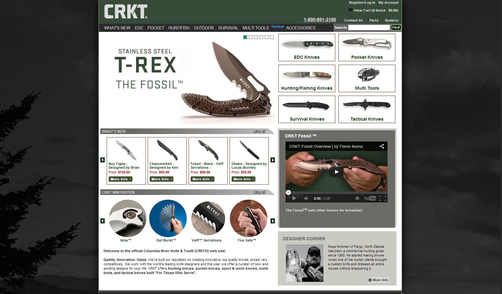
CRKT’s new branding (which, interestingly, comes not long after Kershaw’s rebranding) features a more serious typography-centric logo and a more subdued color choice — a deeper green compared to the former forest green. Gone is the mountain icon in favor of a subtle knife slash to the K. Like Kershaw’s new logo, the typography of the company name favors clean lines and slightly rounded corners. The branding, done by Oregon-based agency Blue Collar, has since been launched accompanied with a website overhaul.
This means that CRKT knives bearing the older logo might become more valuable, but much of this is dependent on their 2014 success. Like the importance of a tang stamp, branding means something to collectors. The question is, is CRKT’s reputation strong enough now to create a demand for early branding knives? While there’s still some debate over CRKT’s new look, it’s hard to argue against the change and their desire to better compete. This, along with an array of unique designs (many of which I saw at SHOT and are certainly worth checking out) might be enough to make them one of the stand-out brands of 2014. However, because CRKT’s old logo is so prevalent and plenty of knives with that branding are still available, collector’s demand might take some time.
Mid-level companies like CRKT and Kershaw tackling rebranding efforts suggests their desire to be taken more seriously as competition in the ever-growing EDC market, and it will be interesting to see how collector demand is impacted. To learn more about CRKT’s new brand, visit Blue Collar’s website for a breakdown on the concept and approach.
